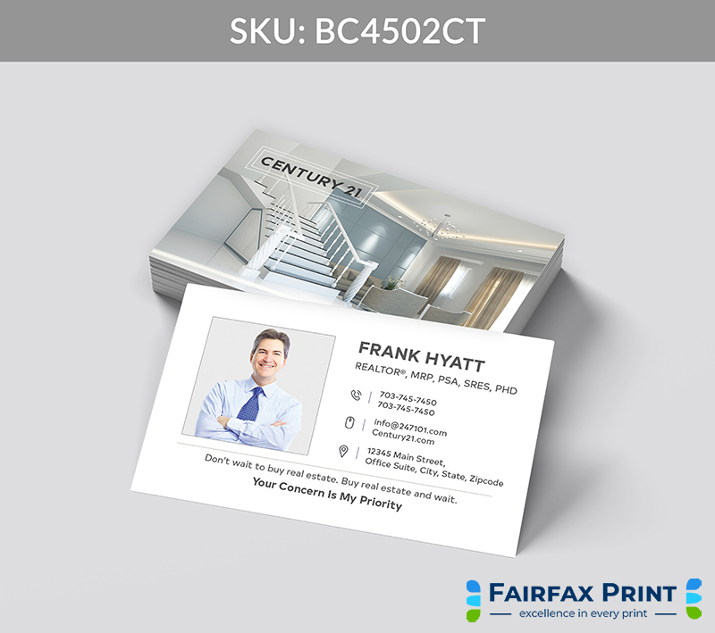
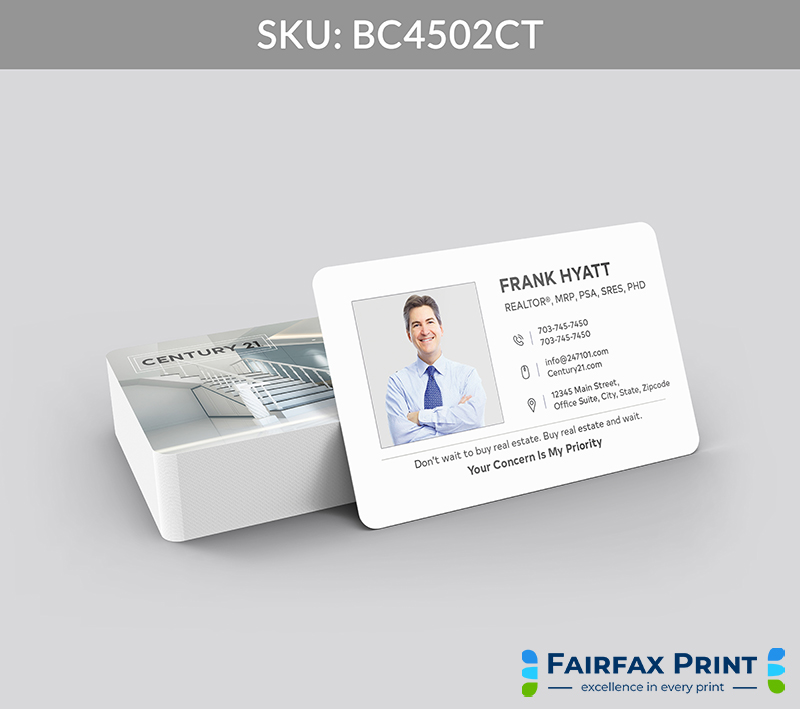
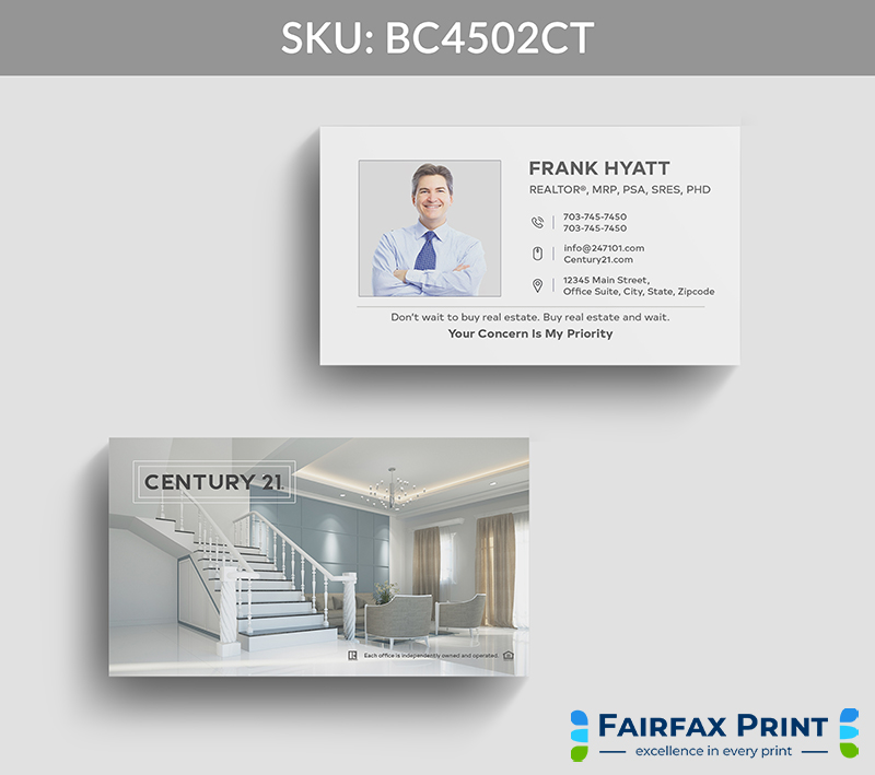
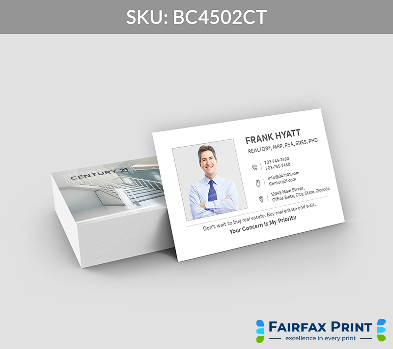
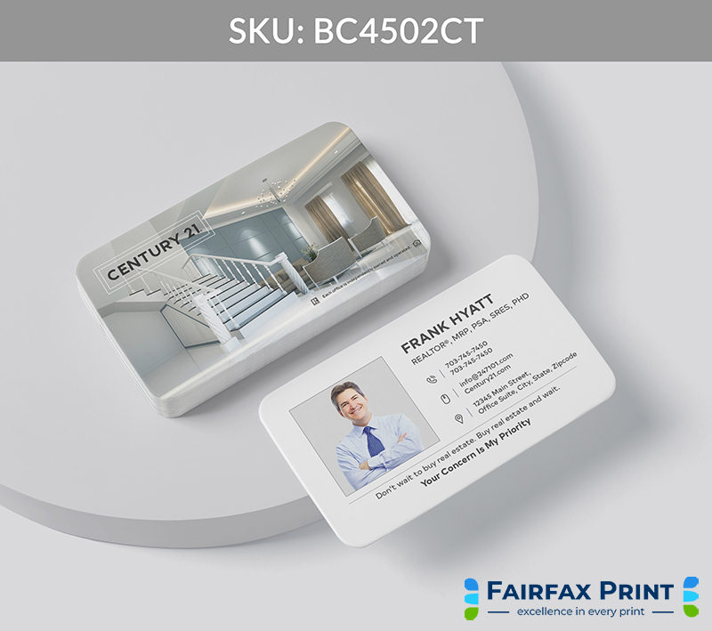
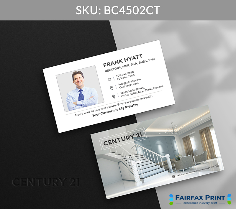
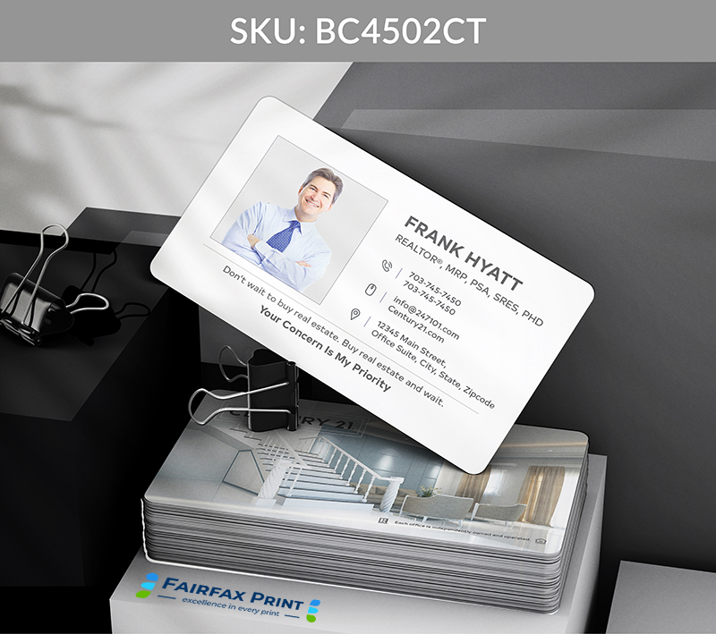
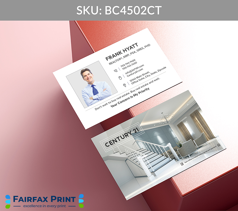
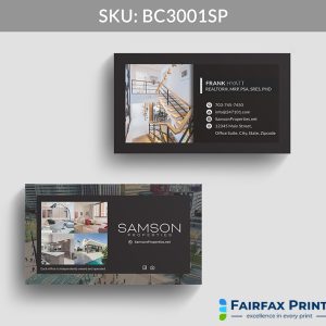
Minimalist and polished, this layout places key contact information on the right with a standout slogan displayed at the bottom—perfect for reinforcing your value proposition at a glance.
This elegant and streamlined design reflects the precision and clarity that Century 21 agents bring to every client relationship, ensuring your essential information is presented with utmost sophistication. The refined use of Gold, Grey, and White accents subtly strengthens your brand presence, conveying trust and premium service with every interaction.
Key Features:
Clean Right-Aligned Contact Details: Organizes your information with clarity, making it effortless for clients to reach you.
Prominent Bottom Slogan Placement: Highlights your unique value proposition, reinforcing client confidence at first glance.
Sophisticated Color Palette: Strategic use of Gold, Grey, and White ensures a cohesive look that echoes Century 21’s distinguished brand identity.
Minimalist, Polished Layout: Emphasizes professionalism and elegance, aligning with the high standards Century 21 agents uphold.
Elevate Your Brand Presence
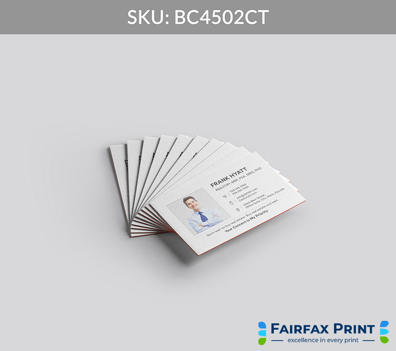
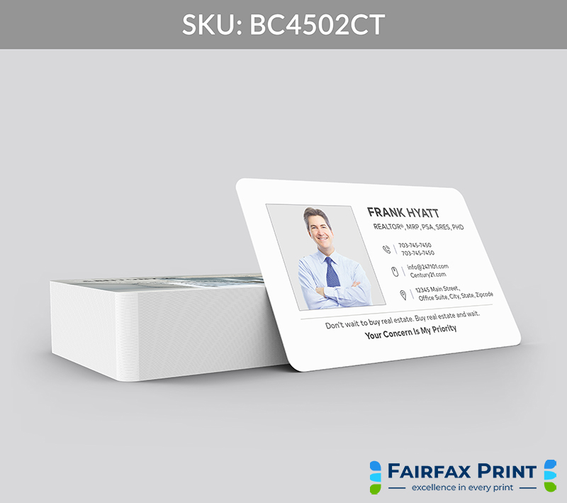
Soft-Touch Matte Finish: Adds a luxurious tactile element that enhances the understated elegance of the card while complementing the Gold and Grey tones.
Gold Foil Accents: Use subtle foil stamping on your slogan or name to add shimmer and sophistication, perfectly matching Century 21’s iconic gold.
Call to Action (CTA):
👉 Trust FairfaxPrint.com to craft a business card that mirrors your Century 21 professionalism—make every introduction confidently memorable.
Here are few ideas:
Share this card during client consultations to clearly communicate your contact info and commitment.
Distribute at networking events where the sleek design and brand colors reinforce your professionalism.
Include with listing presentations or open house materials to strengthen your personal brand and brokerage affiliation.
Question: Can I customize the slogan displayed at the bottom?
Yes, FairfaxPrint.com lets you tailor the slogan to best express your unique real estate value and client promise.
Question: How do the Gold, Grey, and White colors enhance branding?
These colors unify your card with Century 21’s premium identity, helping clients instantly recognize and trust your affiliation.
Question: What finishing options complement this minimalist design?
Our soft-touch matte finish and gold foil stamping add luxury and tactile appeal without compromising simplicity.
Question: Is the contact information layout optimized for quick reading?

